Make the most of Interactive Charts
In this article:
- 1
-
How to access the charts
Effectively conveying complex financial information to clients is crucial for their understanding and engagement. Snap's interactive charts provide an innovative solution to communicate financial journeys in a simple and engaging manner visually.
In this article, we will explore how you can use Snap's interactive charts in your client conversations.
You can access the charts from both the Planning Pages as well the Reports. To access the charts from the Planning Pages, click the Charts button just above the projections table in the center of the Planning page.

If your Planning page has a lower resolution, or your window is smaller, the buttons will be displayed as icons. Click the button with the Charts symbol in the same location.

To access the Charts from the Reports, go to Client Reports -> Report Builder. Select the individual charts from the Gallery and drag them over to Included Pages. Reorder by dragging and dropping under Included Pages.
These are the available charts:

Charts used for Historical Scenarios, Randomized Scenarios and Trends (within the Compare Scenarios feature) are also interactive.
- 2
-
Watch an 8 minute video demonstration
- 3
-
Key features of the Interactive Charts
- Presenting a Financial Story: Snap's visually appealing charts help advisors deliver a compelling narrative that allows clients to grasp important information quickly. For instance, the Cash Inflows chart can showcase the origin of income during retirement, facilitating a clear understanding of the financial journey ahead.
- Mouse-over Pop-up Windows: Hovering the mouse over chart content triggers pop-up summaries, providing a convenient way to highlight specific milestones or changes in a client's financial situation over time. This feature is particularly beneficial when using the Net Worth chart, as it allows advisors to emphasize significant events or fluctuations to enhance client comprehension.
- Customizable Display: Snap's interactive charts offer the flexibility to choose what to display. By clicking on an item's name in the chart's legend, advisors can remove or add it back to the chart. Alternatively, hovering over an item's name highlights it within the chart. This functionality empowers advisors to focus on specific incomes or assets, facilitating more in-depth conversations tailored to clients' individual needs. Display the charts in nominal or real dollars.
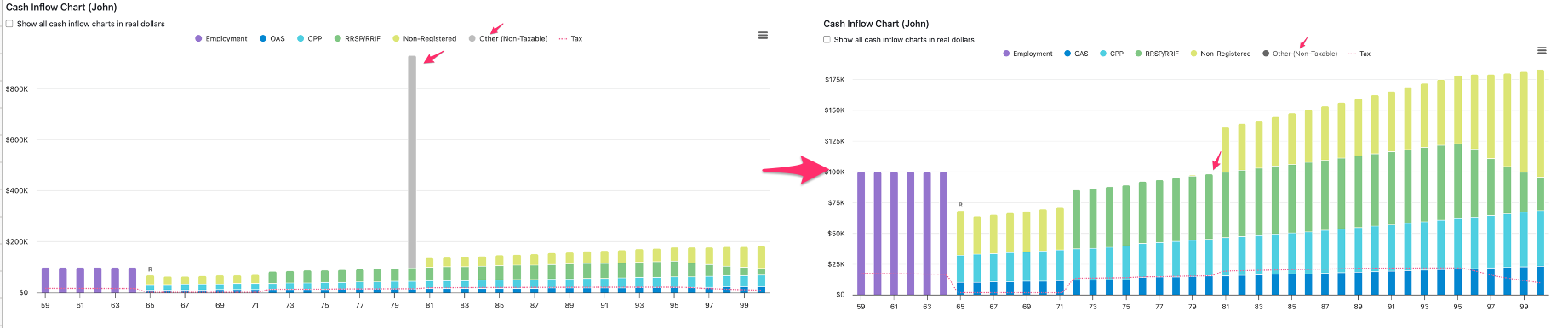
- You can remove large spikes in charts by clicking the relevant legend item. This is helpful in cases where there is a large inflow or outflow due to examples like a real asset sale or lump sum income received. This method works well when there aren't other items in that same category that you wish to display. (The video above also demonstrates this.)
-
- Full-Screen View and Print Options: Snap's interactive charts can be viewed in full screen, enabling advisors to present information in a visually impactful manner. Additionally, the ability to print charts individually provides the flexibility to tailor physical materials for clients. By adapting the presentation format, financial advisors can ensure optimal communication based on their client's preferences and requirements.

